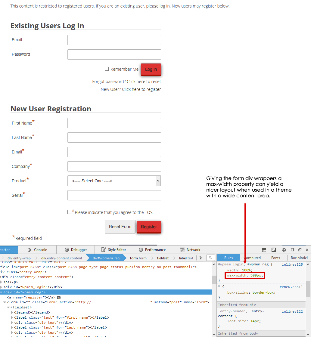
If you use a theme that has a fairly wide main content area and couple that with one of the plugin’s default stylesheets that uses a percentage width for the form, you may find it useful to add a property definition of max-width to set maximum width for the forms.
If you take a look at my recent post on adjusting form floated elements, you’ll see a form that uses a fairly wide content area and how this spreads out the form. This example will give that a maximum width.
The stylesheet that was being used on that form was/is generic-rigid.css. That particular stylesheet sets the width of the login and registration forms at 100% of the content area they are placed by setting this definition for the div wrappers for those forms (wpmem_login and wpmem_reg).
We can add a property definition for “max-width” and in this example set that to 500 pixels to tighten up the form a little bit. This will keep things responsive, but will also give us a maximum width if things get too wide.
I use the FireFox developer tools to do live testing of CSS changes in the browser. This example shows what that looks like. But there are other similar tools available. Either way, these type of tools make testing possible CSS changes much easier because you can see how it affects the layout in real time.
Once you’ve tested out a change like this, you need to apply it. There are a couple of approaches to that.
First, some people just edit the stylesheet in the plugin directly. I don’t recommend that as such because when you update the plugin, that file will be overwritten.
A better alternative to that is to take that stylesheet and make a copy of it. Edit the copy and save that somewhere outside of the plugin (I usually use the theme folder). Then map that in the custom stylesheet option in the plugin’s options tab. See “Customizing Forms” in the User Guide for more information on doing this.
