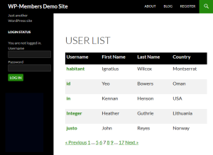
Note: The User List plugin now has an option to apply a table style layout to the list. It is available in the plugin’s settings. Applying that setting automatically applies style to the list that is what is discussed in this tutorial (i.e. you don’t need to do this customization anymore). However, I have left this discussion on the site because it shows a process of customizing the layout and can be used to teach necessary concepts for customizing the plugin.
 I recently was asked if the User List extension could display a table style layout with links to a more detailed user profile. My initial thought was “Great idea. How can we do that?”
CSS is a powerful tool, and with a little bit of CSS here, and a very simple filter (only for the heading), you can have a table style layout for the user list that looks like the screenshot to the left.
The screenshot was taken from the my test of how to put together such a customization. To be very honest, it took me less than 30 minutes to put this together – and that’s working from scratch. I’ll show you in this post exactly what I did, so while it might take you a little time to read, it should take you only a few minutes to implement.
 To gain full access to WP-Members premium content, a current support subscription is required. You can purchase
an annual support subscription for as little as $59, which provides you with access to priority support, a
customer support forum, access to code snippets, and more.
Why wait? Choose your subscription option here.
[Why join?]