Some of the generic stylesheets included with the plugin use the CSS property definition “float” to align the form label and input tags next to each other in a pure CSS fashion.
Sometimes, CSS from the theme and the plugin can collide in a way that causes these elements to not be in alignment. The result can make the form look rather strange because some elements will be squeezed out of place.
Here’s a screenshot of an actual client site that has this issue:
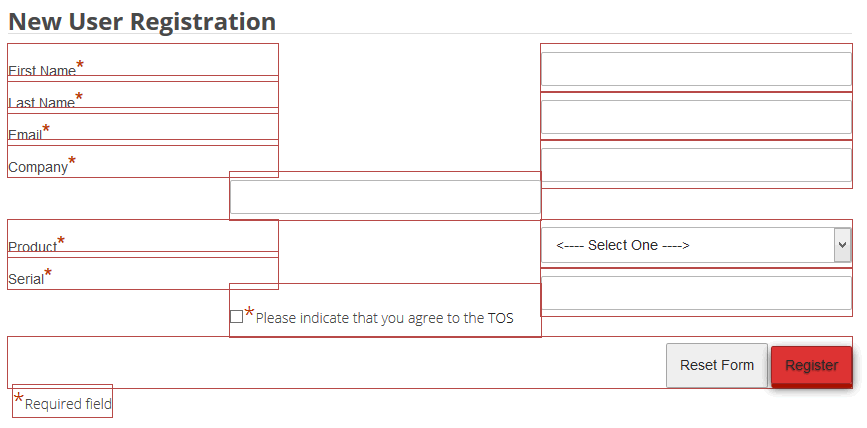
Note how the fourth input is squeezed out of alignment, as well as the TOS checkbox and label. Some CSS adjustment is necessary to get this corrected.
So first, what is the cause of this?
To find out, let’s look at the same screenshot of the form with the floated elements outlined:
Now it is a little easier to see what is happening. Also note the height of the elements on the left (the labels) compared to the height of the elements on the right (the input tags wrapped with a div tag). The height difference should be apparent.
I use Chris Pederick’s Web Developer extension for FireFox and Chrome which easily allows you to outline any element on the page. This is tremendously handy for tracking down layout issues when doing design work. I use the FireFox developer tools to do live testing of CSS changes in the browser. So these examples show that. But there are other similar tools available. Either way, these type of tools make testing possible CSS changes much easier because you can see how it affects the layout in real time.
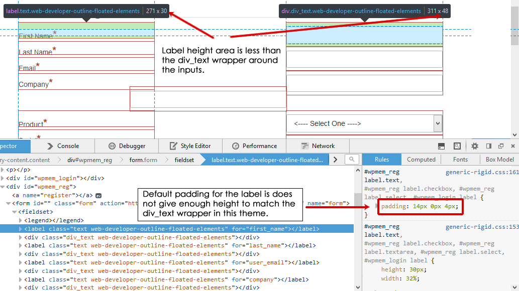
So looking at the properties of the label tags and the div_text wrapper around the inputs, we can see the height difference:
You can see here that the “generated” height (the actual height plus any applied padding and margins plus the height, padding, and margins of any nested elements) of the labels is 30 pixels where the div_text wrapper is 48 pixels. That is why our floated elements are out of alignment.
This image also shows you the CSS property we can adjust to change this. I have highlighted in red the padding definition for the HTML label tag. In this stylesheet (generic-rigid.css), the padding is “14px 0px 4px”. This means the top padding is 14 pixels, the right and left are 0, and the bottom is 4.
We are not really concerned about the right and left in this example, but we are concerned about the top and bottom. We need it to be higher.
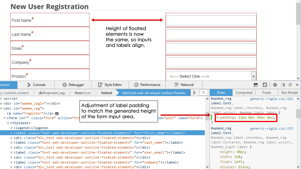
One thing that is nice about the FF development tools is that we can test adjust this in the browser to see if what we want to change will work. So I made some adjustments and found “12px 0px 34px” to work (note: my example shows “12px 0px 34px 4px” with the 4 being the left padding – but we’re only worried about top and bottom). That shifts things into alignment:
Once you’ve tested out a change like this, you need to apply it. There are a couple of approaches to that.
First, some people just edit the stylesheet in the plugin directly. I don’t recommend that as such because when you update the plugin, that file will be overwritten.
A better alternative to that is to take that stylesheet and make a copy of it. Edit the copy and save that somewhere outside of the plugin (I usually use the theme folder). Then map that in the custom stylesheet option in the plugin’s options tab. See “Customizing Forms” in the User Guide for more information on doing this.


